I've been following with interest John Graham-Cumming's
analysis
of the recently released UK Met Office "Land Surface Temperature" data, for which he also
released the source code.
The gnuplot graphs he released though could have been pimped up a bit, so this is what I'm going to do below.
to generate antialiased plots, so I built the latest in order to generate the following.

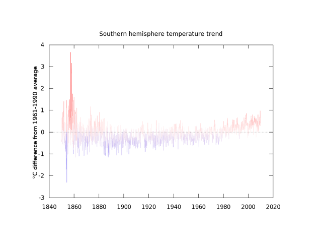
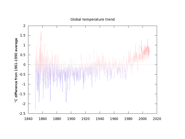
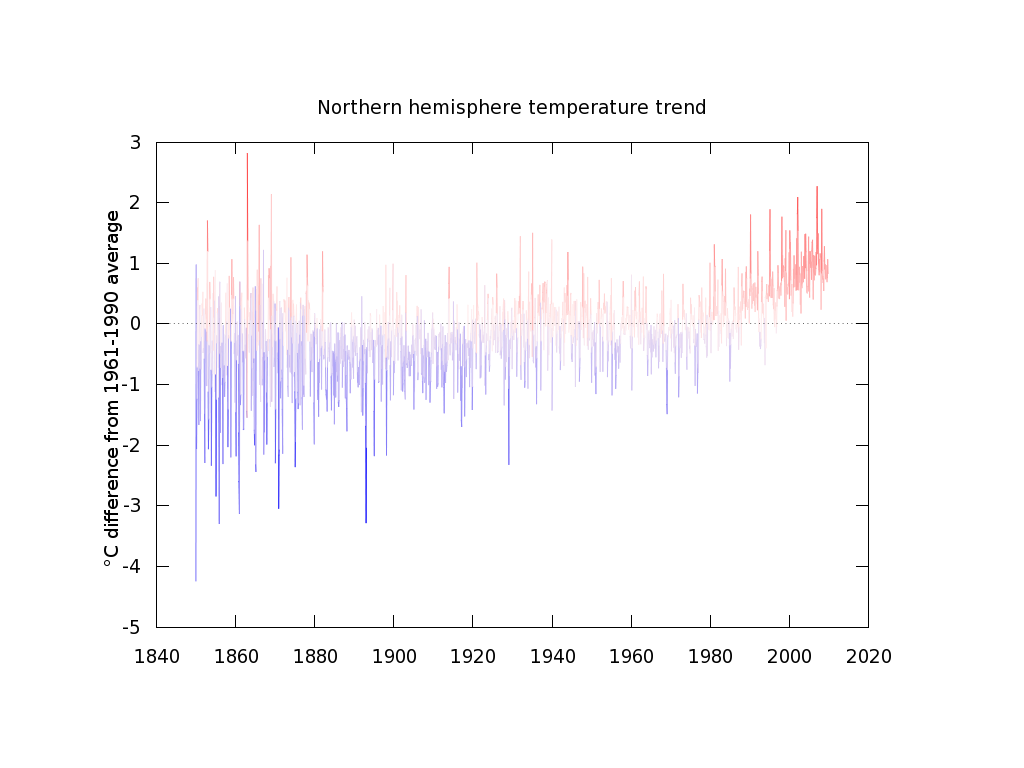
The following gnuplot script, shown as displayed in vim, was used to regenerate the 3 trend graphs from the output data. The essential difference is that the graphs are now antialiased, and we use colour to try to better indicate the warmer and cooler periods using the very cool pm3d functionality of gnuplot.
set term pngcairo font 'Sans,14' size 1024,768

# Parse the time series output from JGC's perl script
# and setup the x axis so there's a tic every 20 years
set xdata time
set timefmt "%Y.%m"
set format x "%Y"
set xrange ['1840.01':'2020.01']
set mxtics 0
set xtics "1840.01",631100000,"2020.01"

# Use pm3d to map the values to a colour.
# We use a narrow cbrange around white, to give more vivid colours
set view map
set pm3d explicit
set cbrange [-3:3]
set palette defined (-3 "#0000FF", 0 "#FFF0F0", 3 "#FF0000")
unset colorbox

set xzeroaxis
set ylabel "°C difference from 1961-1990 average"

set title "Global temperature trend"
set output "global.png"
# The last :2 specifies that the palette colour is determined by the y value
splot "MetOffice08122009TrendGlobal.dat" using 1:2:2 notitle with lines palette

set title "Northern hemisphere temperature trend"
set output "north.png"
splot "MetOffice08122009TrendNorth.dat" using 1:2:2 notitle with lines palette

set title "Southern hemisphere temperature trend"
set output "south.png"
splot "MetOffice08122009TrendSouth.dat" using 1:2:2 notitle with lines palette
Note the version of "gnuplot" that comes with my Fedora 11 linux distro does not support the "pngcairo" canvas
to generate antialiased plots, so I built the latest in order to generate the following.

gnuplot is one of those UNIX DSLs that I definitely recommend taking a few hours to learn. For more gnuplot tricks and information I suggest subscribing to the gnuplot tricks blog which really has some great examples of gnuplot's capabilities.
© Dec 14 2009